Pathfora is built to be entirely customizable for developers. With the javascript config alone you can change the colors of any element of the module. But, to make your module fully fit the look and feel of your site you can add custom CSS.
Key Class Names
The outer most <div> of all Pathfora modules have the pf-widget class. For most modules this will be the containing div surrounding the content, but for modal and gate modules this div will contain the full-screen overlay behind the module. pf-widget has a number of useful subclasses to help select modules by their settings from the javascript config.
Subclasses of pf-widget:
| Class Name | Use |
|---|---|
pf-[type] |
select modules by type |
pf-widget-[layout] |
select modules by layout |
pf-position-[position] |
select modules by position |
pf-widget-variant-[variant] |
select modules by variant |
opened |
added once the module becomes visiable to the user, can be used for changing the transition animation |
Within the pf-widget div most key elements are assigned class names. Form components are nested in a <form> element and should be selected and styled by element type.
Key Classes:
| Class Name | Element |
|---|---|
pf-widget-content |
second container div inside pf-widget (for modal and gate layouts this will the the box surrounding the actual module content) |
pf-widget-text |
third container div inside pf-widget for modals, gates, and inline layouts (it contains the text: headline and message/form) |
pf-widget-headline |
<h2> headline text |
pf-widget-message |
<p> containing widget message text |
pf-widget-close |
"x" icon to close the modal |
pf-widget-btn |
general class for all buttons |
pf-widget-ok |
"Confirm" button |
pf-widget-cancel |
"Cancel" button |
pf-widget-img |
image element for modules of variant 2 |
To see these classes in action, you can view the html templates that will be rendered on your website. This is the html that gets minified, and added to a div with the class pf-widget. That div then gets added to the DOM of your website.
Custom Class Name
All modules use the pf-widget class and thus any styles applied to this class and sub-elements will effect all modules used on the page. If you want to select and style a single module without using its id as a selector, you can add a custom class name to the pf-widget div in your javascript config.
var module = new pathfora.Subscription({
  id: 'form-css',
  className: 'sign-up-newsletter',
  layout: 'modal',
  headline: 'Sign Up!',
  msg: 'Submit this form to get updates'
});

pathfora.initializeWidgets([module]);
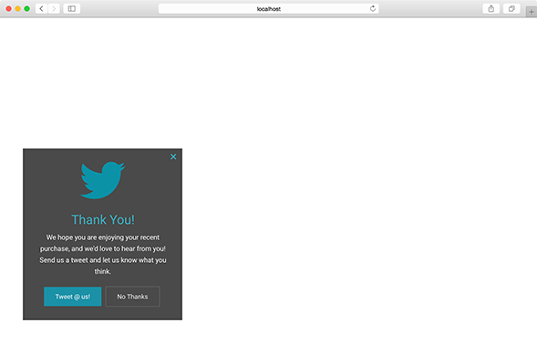
Example
Live Preview
Javascript
CSS
SASS/LESS
.pf-widget {
  &.pf-twitter-module {
    background-color: #4a4a4a;
    color: #fff;
    border-radius: 0px;
    box-shadow: none;
    font-family: Roboto, Arial, 'sans-serif';

    /* message paragraph */
    .pf-widget-message {
      font-size: 15px;
      line-height: 1.7;
    }

    /* headline */
    .pf-widget-headline {
      font-size: 28px;
    }

    .pf-widget-close, .pf-widget-headline {
      color: #39aec0;
    }

    /* buttons */
    .pf-widget-btn {
      border-radius: 0px;
      padding: 1px 25px;
    }

    /* confirm button */
    .pf-widget-btn.pf-widget-ok {
      background-color: #1b91a7;
      color: #fff;
      box-shadow: none;
    }

    /* cancel button */
    .pf-widget-btn.pf-widget-cancel {
      background: transparent;
      color: #fff;
      border: 1px solid #6a6a6a;
    }

    /* img */
    .pf-widget-img {
      border-radius: 0px;
    }
  }
}